Components
Browse a catalog of accessible UI components and install one into your project in a click.
The Components panel is a catalog of ready UI building blocks, such as a dialog, tabs, a date picker or a data table. Install one and its source code is added to your project, where you and the AI can use it.
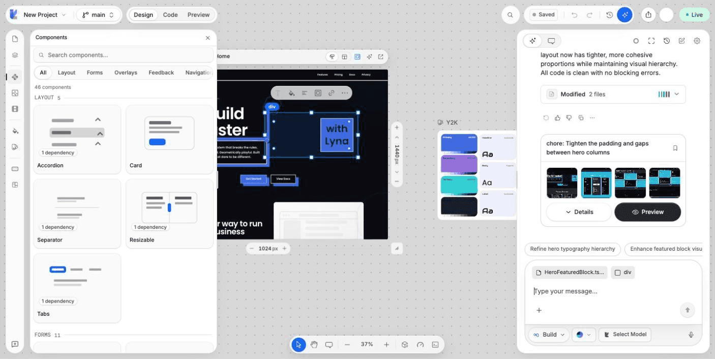
What you can do
- Browse components by category.
- Search components by name.
- See how many packages a component needs.
- Install a component into your project.
- See which components are already installed.
Install a component
Open Components
Choose Components in the rail on the left of the editor.
Find one
Pick a category (Layout, Forms, Overlays, Feedback, Navigation, Data Display, Media or Utilities), or type in Search components....
Install it
Choose the component card. Lyna installs it in your sandbox and shows a message when it is installed. Installed components show an Installed badge.
The components come from the shadcn/ui collection. The first install sets the collection up in your project, which you see as Initializing shadcn/ui....
Where the code goes
Each component is added to src/components/ui/, for example src/components/ui/dialog.tsx. The packages it needs are added to your package.json. Your project theme is applied again after the install, so the component matches your brand.
Use it with the AI
Once a component is installed, ask the AI to use it, for example: "Show the sign-up form in a dialog". The AI works with the files in your project.