Styles
The Styles panel lets you edit CSS visually. Select an element on the canvas, open the Styles tab, and adjust layout, spacing, typography, colors, effects, and positioning. Every change becomes a Tailwind CSS class applied to the source code in real time.
Accessing the Styles panel
Click the Styles tab (paint bucket icon) in the left panel sidebar. The panel appears when you have an element selected.
Breakpoint-aware editing
The top of the panel has a breakpoint selector showing the current Tailwind breakpoint:
| Breakpoint | Label | Min width | Icon |
|---|---|---|---|
| Base | Base | 0px | Mobile |
| SM | SM | 640px | Mobile |
| MD | MD | 768px | Tablet |
| LG | LG | 1024px | Laptop |
| XL | XL | 1280px | Desktop |
| 2XL | 2XL | 1536px | Desktop |
At Base, changes apply to all sizes. At a specific breakpoint (e.g., md), changes get prefixed (e.g., md:flex-row) and only apply at that width and above. This follows Tailwind's mobile-first approach. See Responsive Design for details.
Style sections
The panel is organized into collapsible sections:
Layout
Controls display mode and child element flow:
- Display type: Block, Flex, or Grid
- Direction: Vertical (column) or horizontal (row) for flex
- Horizontal alignment: Left, center, right, or space between
- Vertical alignment: Top, center, bottom, or stretch
- Gap: Spacing between children
- Wrap: Whether flex items wrap
Spacing
Padding and margin:
- Padding: Inner spacing on all four sides
- Margin: Outer spacing on all four sides
- Individual controls: Set each side independently or all at once
- Unit support: Pixels, rem, or percentages
Typography
Text appearance (auto-expands when a text element is selected):
- Font family: Project fonts or system fonts
- Font size: Pixels, rem, or other units
- Font weight: Thin through black (100-900)
- Line height: Space between lines
- Letter spacing: Space between characters
- Text color: Color picker with semantic tokens and custom values
- Text alignment: Left, center, right, justify
- Text decoration: Underline, strikethrough, none
- Text transform: Uppercase, lowercase, capitalize, normal
Appearance
Visual style:
- Background color: Solid color with picker, supports semantic tokens
- Border: Width, style, color, radius
- Border radius: Per-corner control
- Opacity: 0 to 100%
Effects
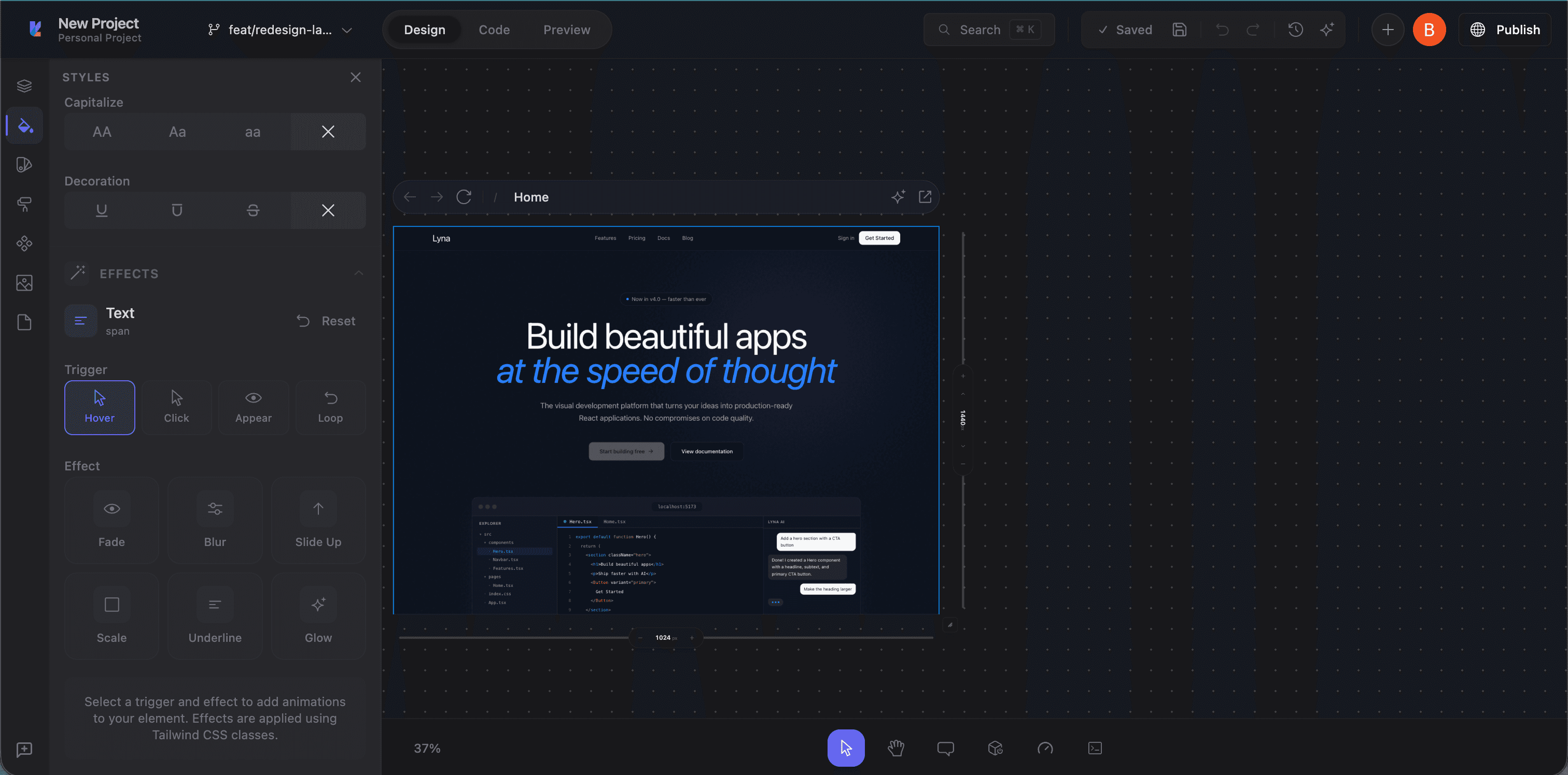
A preset-based animation system. Pick from curated effects instead of configuring raw CSS:
Presets by element type:
- Text: Fade, blur, slide, color shift, typewriter, and more
- Button: Scale, bounce, glow, shake, pulse
- Image: Zoom, tilt, parallax, reveal, ken burns
- Container: Expand, morph, flip, stagger
Triggers:
- Hover: On mouse hover (e.g.,
hover:scale-105) - Click: On click/active (e.g.,
active:scale-95) - Appear: When entering the viewport (e.g.,
animate-in fade-in) - Loop: Continuous repeat (e.g.,
animate-pulse)
Intensity:
- Subtle: Minimal, professional
- Normal: Standard
- Strong: Dramatic, attention-grabbing
Each preset generates Tailwind animation classes (transition-*, animate-*, hover:*). The effects section integrates with EaseMate for easing functions.
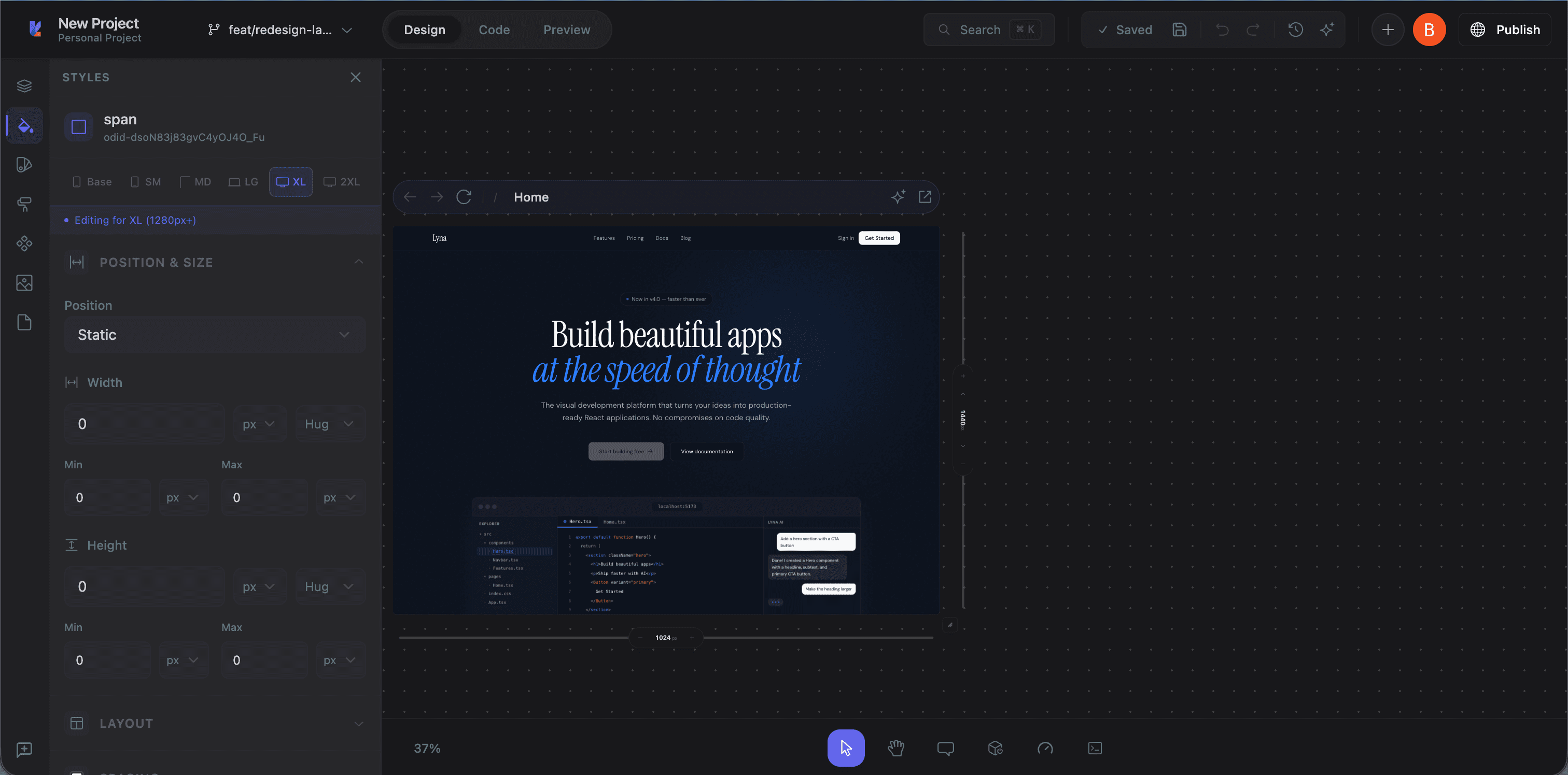
Position
Document flow and sizing:
- Position type: Static, relative, absolute, fixed, sticky
- Offset: Top, right, bottom, left for positioned elements
- Z-index: Stacking order
- Width and height: Explicit dimensions
- Min/max constraints: Minimum and maximum width or height
How values are applied
Every change converts to a Tailwind class in the source code:
- Padding
16pxaddsp-4 - Background primary color adds
bg-primary - Flex direction horizontal on
mdbreakpoint addsmd:flex-row
Code editor and canvas both update immediately.
Editor bar quick controls
The editor bar at the top of the canvas provides quick access to common style controls without opening the full panel:
- Width, height, padding, margin inputs
- Background and border color pickers
- Border radius and opacity sliders
- Flex direction and alignment toggles
Controls adapt based on the selected element type (div, text, image, or frame).
Tips
- Start with Layout: Get the structure right before adjusting spacing and appearance.
- Use the breakpoint selector for responsive adjustments rather than fighting one set of values.
- Use semantic color tokens:
bg-background,text-foreground,bg-primaryadapt to light/dark themes automatically. - Check the code: If you're unsure what Tailwind class a style change produces, switch to Code mode and inspect.