Brand & Theming
The Brand panel gives you centralized control over your app's visual identity. Pick a theme preset, customize colors, set border radius, configure fonts, and toggle between light and dark mode. No CSS files to edit manually.
Accessing the Brand panel
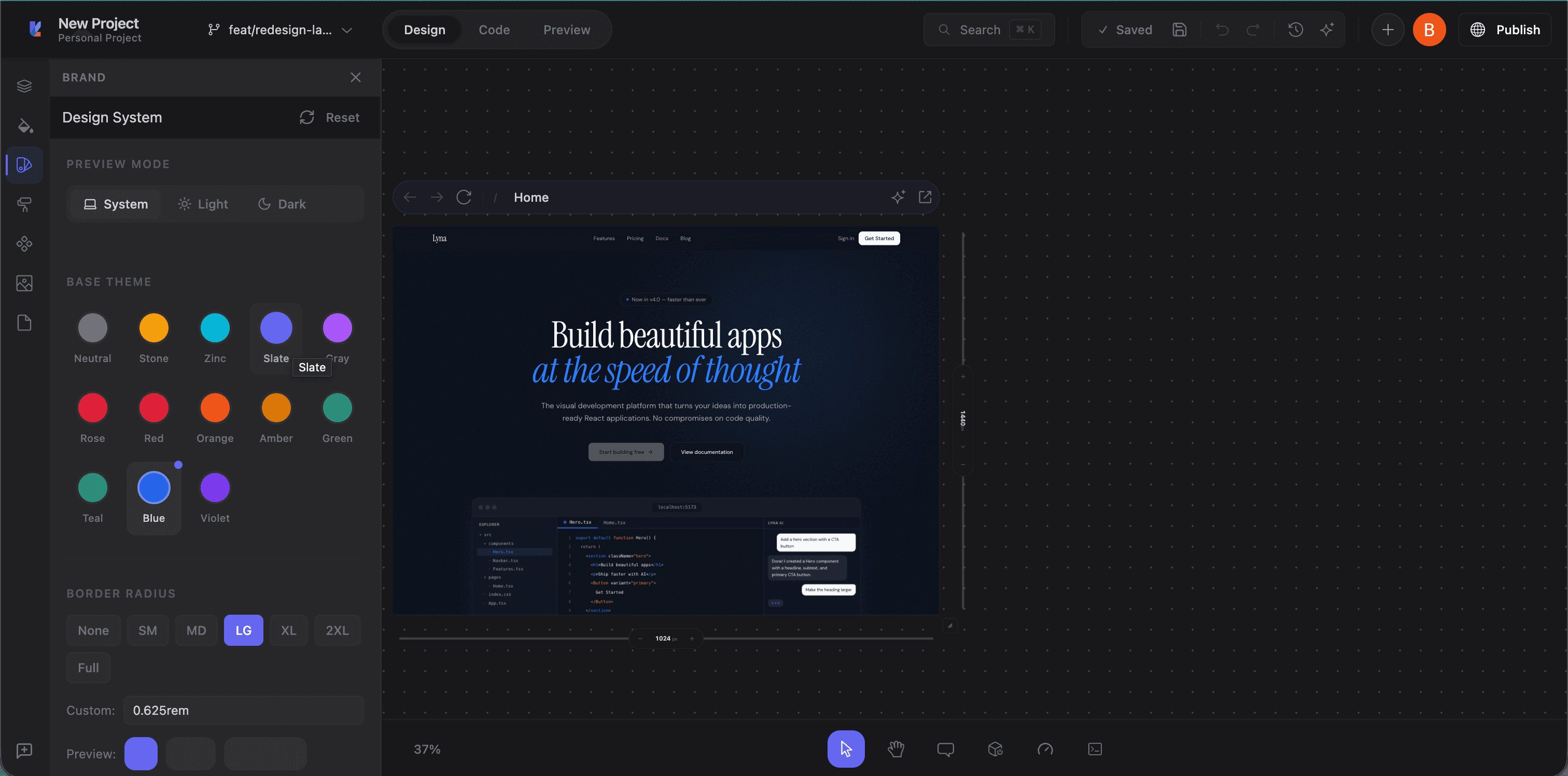
Click the Brand tab (star icon) in the left panel sidebar. The panel opens with sections for theme mode, presets, border radius, typography, and colors.
Theme presets
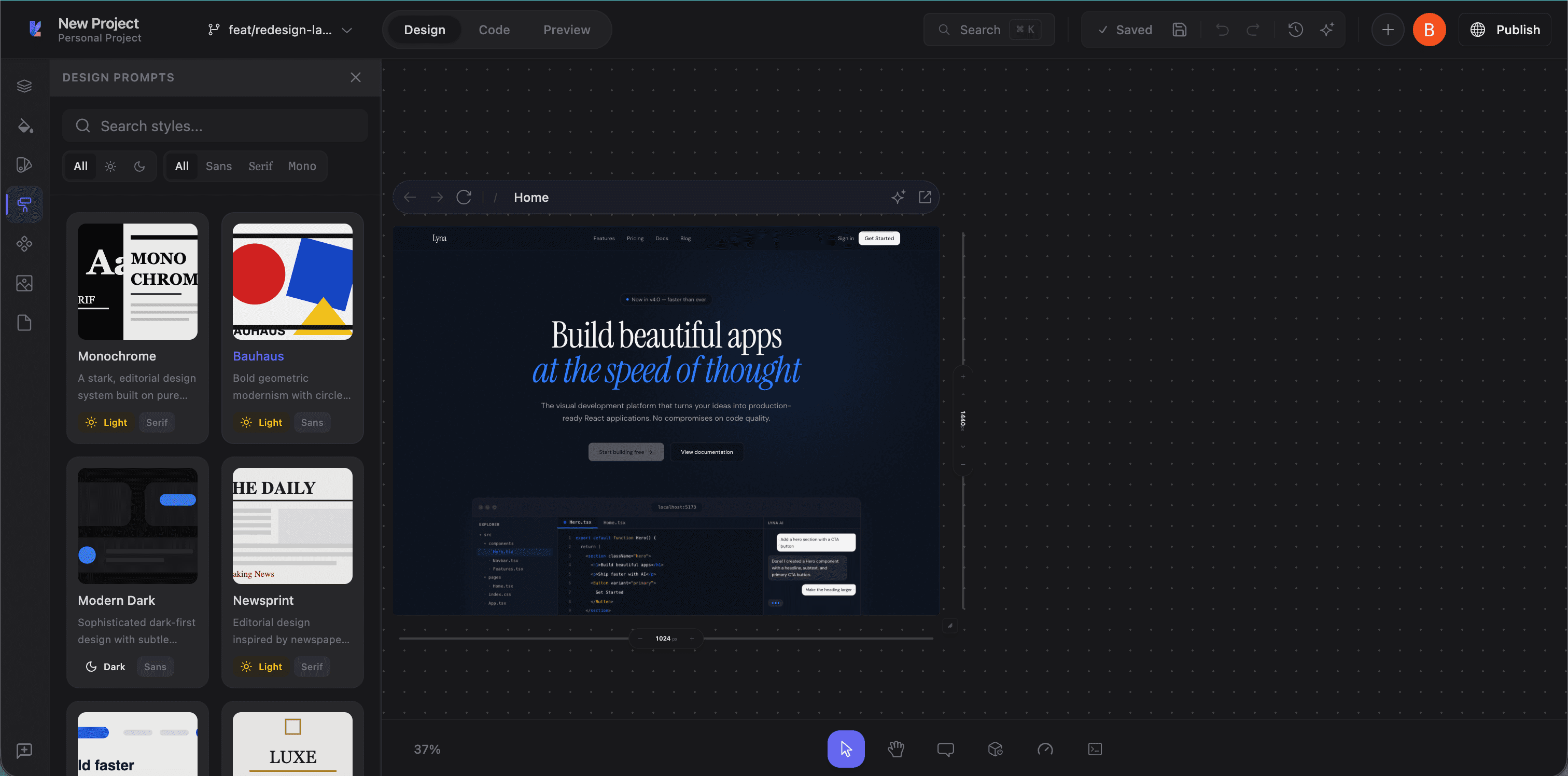
Lyna includes pre-built shadcn/ui theme presets. Each defines a complete set of semantic colors for both light and dark mode:
- Default: Standard shadcn/ui theme
- Rose: Warm rose accents
- Blue: Cool blue primaries
- Green: Natural green palette
- Orange: Vibrant orange accents
- And more covering a range of color personalities
Click a preset swatch to apply it. The preset updates CSS custom properties in your globals.css, and the canvas reflects the change immediately.
Theme mode
Toggle your preview between three modes:
- Light: Light color scheme
- Dark: Dark color scheme
- System: Follow the system preference
Your app's CSS includes both :root (light) and .dark variable definitions, so end users can switch themes at runtime.
Color customization
Below the presets, the panel shows all semantic color categories:
Color categories
| Category | Controls |
|---|---|
| Base | Background, foreground, and border colors for the page |
| Card | Card backgrounds, text, and borders |
| Popover | Popover and dropdown backgrounds and text |
| Primary | Primary action colors (buttons, links, active states) |
| Secondary | Secondary action colors |
| Muted | Muted backgrounds and subdued text |
| Accent | Highlights and interactive states |
| Destructive | Error and destructive action colors |
| Form | Input borders, ring colors, form elements |
| Chart | Data visualization colors (5 slots) |
| Sidebar | Sidebar-specific navigation colors |
Editing a color
Click any swatch to open a color picker:
- Pick visually with the color wheel
- Enter an exact value (oklch format for Tailwind v4)
- See both light and dark mode values
Changes write to your CSS file and the canvas updates live.
Border radius
A slider controls the global --radius CSS custom property used by all shadcn/ui components. Drag it to adjust, and buttons, cards, inputs, dialogs, and everything else update on the canvas.
Typography
Installed fonts
View fonts currently in your project. These appear in the Styles panel's font family selector.
Google Fonts search
- Type a font name in the search field
- Browse results with previews
- Click to install
Font files are downloaded and added to your project automatically.
Custom font upload
Upload your own font files (WOFF, WOFF2, TTF, OTF):
- Click Upload
- Select your font files
- Fonts are installed and available in the typography controls
How theming works
Lyna's theming uses CSS custom properties following shadcn/ui conventions. Colors are defined in oklch format for Tailwind CSS v4 compatibility:
:root {
  --background: oklch(1 0 0);
  --foreground: oklch(0.145 0.015 285);
  --primary: oklch(0.205 0.045 265);
  /* ... */
}

.dark {
  --background: oklch(0.145 0.015 285);
  --foreground: oklch(0.985 0 0);
  --primary: oklch(0.925 0.015 285);
  /* ... */
}
When you apply a preset or customize a color, Lyna updates these variables in globals.css. The entire UI references them through Tailwind classes (bg-background, text-primary, border-border), so a single change propagates everywhere.
Reset to default
Click Reset in the Brand panel header to revert all customizations to the default shadcn/ui theme.
Tips
- Start with a preset: Pick the closest one to your target look, then tweak individual colors.
- Design in dark mode too: Toggle to dark while customizing to make sure both modes look right.
- Use semantic tokens in code: Always use
bg-background,text-foreground, etc. instead of hardcoded colors, so components respond to theme changes. - Test with real content: Theme changes affect everything. Check multiple pages and states.