Components Library
The Components Library panel gives you access to the full shadcn/ui catalog. Browse by category, see previews, and install with one click. No terminal commands needed.
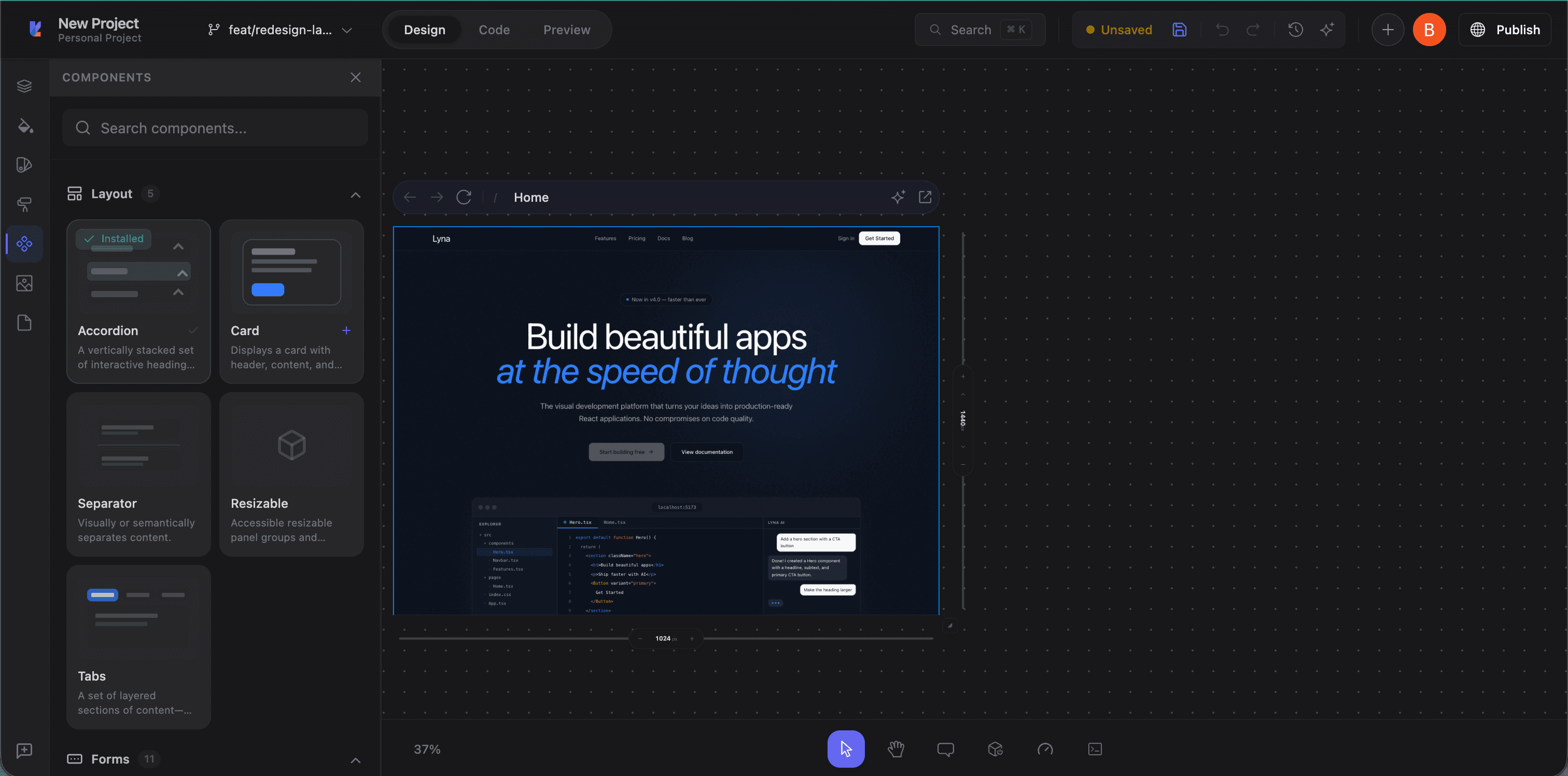
Accessing the Components Library
Click the Components tab (puzzle piece icon) in the left panel sidebar.
Component categories
| Category | Components |
|---|---|
| Layout | Accordion, Card, Collapsible, Resizable, Scroll Area, Separator, Sheet, Tabs |
| Forms | Button, Checkbox, Combobox, Date Picker, Input, Label, Radio Group, Select, Slider, Switch, Textarea, Toggle |
| Overlays | Alert Dialog, Dialog, Drawer, Dropdown Menu, Hover Card, Menubar, Popover, Tooltip |
| Feedback | Alert, Badge, Progress, Skeleton, Sonner (Toasts) |
| Navigation | Breadcrumb, Command, Context Menu, Navigation Menu, Pagination |
| Data Display | Avatar, Calendar, Carousel, Data Table, Table |
| Media | Aspect Ratio |
| Utilities | Form (React Hook Form integration), Toggle Group |
Browsing components
Search
Type in the search field to filter by name. "button" finds Button, "dialog" finds dialog-related components.
Category accordion
Each category is expandable. Click to expand and see its components. Multiple categories can be open at once.
Component previews
Each component shows:
- Name: e.g., "Button", "Dialog"
- Description: What the component does
- Install status: Checkmark if already installed
Installing a component
- Find the component
- Click Install (or the component card)
- Lyna automatically:
- Creates the component file in
src/components/ui/(orcomponents/ui/) - Installs required npm dependencies (e.g.,
@radix-ui/react-dialog) - Installs registry dependencies (other shadcn/ui components it depends on)
- Creates the component file in
- A success notification confirms installation
Ready to use immediately. Import in code or let the AI use it in Build Mode.
Already installed
Installed components show a green checkmark. Lyna detects them by checking for the file in both src/components/ui/ and components/ui/.
Using installed components
In the AI chat
Tell the AI what you need:
- "Add a dialog that confirms deletion"
- "Create a dropdown menu with these options"
- "Replace this list with a data table"
The AI knows what's installed and imports correctly.
In the code editor
import { Button } from "@/components/ui/button";
import { Dialog, DialogContent, DialogTrigger } from "@/components/ui/dialog";
Through the block inserter
Some components are available as pre-built blocks in the Block Inserter.
Component quality
All components are built on:
- Radix UI primitives: Accessible, headless components
- Tailwind CSS: Utility-class styling for easy customization
- TypeScript: Full type definitions
- ARIA compliance: Proper roles, labels, and keyboard navigation
Following the shadcn/ui philosophy, components are copied into your project (not installed as a dependency). You own the code and can customize freely.
Tips
- Install before building: Install what you need from the library before asking the AI to build UI. The AI will use proper components instead of rolling its own.
- Check for existing components: Before building a custom dropdown, modal, or form, see if shadcn/ui already has it.
- Customize after installing: Components are source files in your project. Modify styling, behavior, or props as needed.